Hi All
Hello and welcome to this week’s CASEing the Catty Blog Hop.
This week we are all CASEing one of our favourite projects from the new 2016 Sale-A-Bration Brochure – which was released on Tuesday 5th January. You can read about Sale-A-Bration (SAB) on the Stampin’ Up! web page
Whether you’re joining the Hop here, or if you’ve hopped on over from the talented Helen Heil – a BIG hello!
Remember to click on through this week’s CTC crew to see plenty of inspirational projects that the crew have created for you – there’s a full list on the CTC blog page if you get lost along the way.
The items that are available to earn for FREE during the 2016 SAB period (5 January – 31 March) are stunning and I didn’t get past the cover in choosing a favourite to CASE!
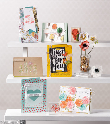
I was drawn to the bright card in the centre of the cover and thought it could do with some Pals Paper Arts treatment! This is a challenge site that “Showcases the Art of Papercrafting” – which this week features a colour challenge by Brian King – #PPA283.
After using a similar palette last week (you can find my “Enjoy the Little Things” CASE here) I was interested to see if I could work with PPA283 and the gorgeous Botanical for You stamp set – but without any DSP!
Here’s my CASE
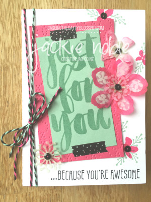
I’ve kept pretty true to the original design but obviously changed the colours – a lot! The colours are those in the It’s My Party Suite.
The Baker’s Twine combo was the perfect accompaniment – though I’ve only put two wrap-arounds as it is a very thick twine compared to our standard Baker’s Twine which was on the original.
I’ve added some texture to the Melon Mambo mat with the elegant dots embossing folder.
Here’s a little tip. See how I’ve put the de-bossed side up rather than the embossed side? Well I do that so that the card sits off the page a little. It’s like popping it up on dimensionals but not as much height as you would get if you’d used dimensionals – I like the effect this gives.
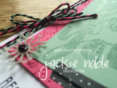
I originally stamped the large sentiment in Black Momento but decided I wanted to restrict the black on the card to be highlights rather than be a featured colour. Hence the black in the twine, the washi, the sequins and the smaller sentiment.
If you are wondering where I got those black sequins from – a trusty Project Life Accessory pack – Love Story. I do get lots of use out of both the Love Story Card Collection and the Accessory Pack which has a hugely versatile colour palette – Basic Black, Basic Grey, White and Silver!
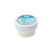
But back to that large sentiment – I stamped it in Versamark to get tone on tone colour, and then heat embossed with clear embossing powder to get that shine!
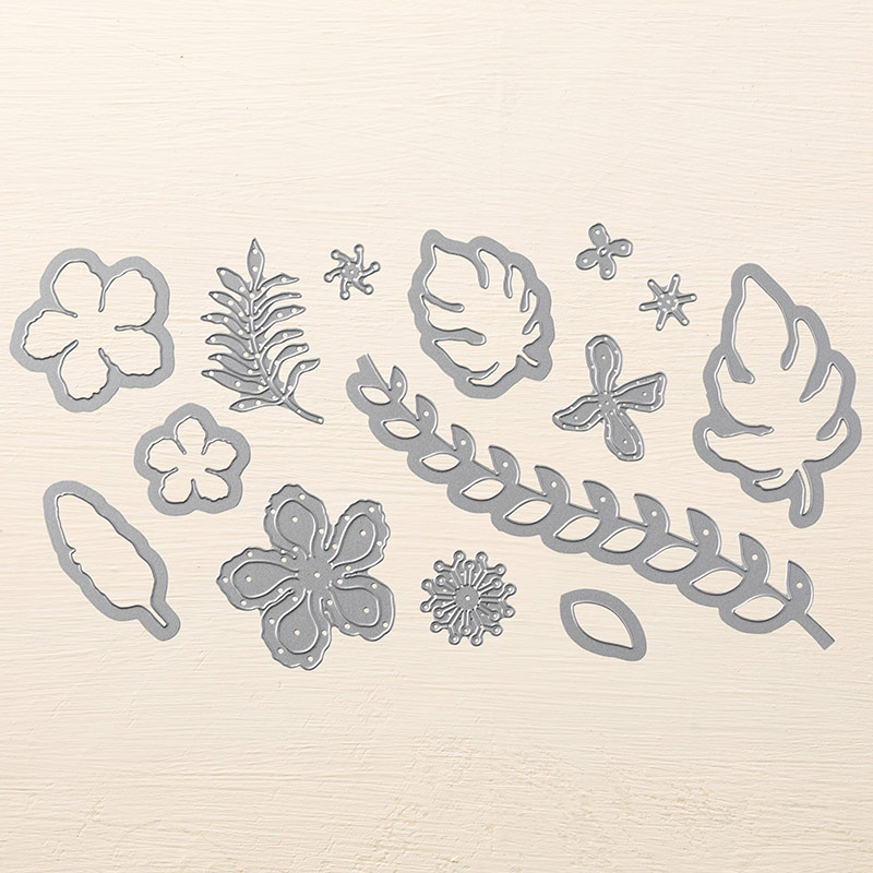
I decided to use the Botanical Builder Framelits rather than butterflies that were on the original card. In the picture above you can see one of the shapes – there are 14 Dies in the set! There are leaves, flower petals, flower centres and even a leaf border! Heaps of options – and you can use them individually or build up layers – just as the name suggests!
It’s hard to tell in the photos above but I have cut the shapes from the Botanica’s vellum stack – another gorgeous SAB item that co-ordinates with the Botanical Garden Suite of products – and which you can earn for free during SAB! I then sponged the shape with some Mint Macaron ink on a sponge dauber. I found the vellum to be a better weight for my card rather than card stock. I considered some It’s My Party DSP – but I’d said I wasn’t going to use DSP in this project – well vellum isn’t DSP – right?
What you can’t tell from the above photos is the way some of the dies in the Botanical Builder framelits cut a 3D type flower – it cuts two petals at the same time. In the photo of the whole card above this is shown by the dark pink rim of the petal and the paler inside (both sponged with Melon Mambo – the outer just has more ink added). This looks like a single layer in that photo – but check out the photo below.
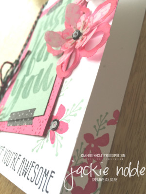
This flower’s bottom petal is like two layers – the dark outer rim I’ve bent downwards, and the paler inner part of the petal I’ve bent upwards – giving a 3D effect. I’ve then added another Melon Mambo sponged petal and placed a Mint Macaron sponge flower centre on top.
I did joint these 3 layers together with a SIlver Mini Brad to keep them securely together but as I wanted black centres, I then adhered a black sequin onto the brad using the Fine Tip Glue Pen with the sequin placed curve down. I love how the Fine Tip Glue pen dries clear and non-tacky.
I sure did have fun with this CASE and colour combo – a bit of a challenge for me – as I’m not really a pink sort of a girl!
Next up you will see a very different colour palette in Rachel Palmieri’s CASE – using The Sky is the Limit stamp set – stunning!
And remember if you get lost along the way – head to the CTC Blog Home Page where you will see all those involved in this week’s CASEing the Catty Blog Hop and make sure you haven’t missed any of the great creations!
Thanks for stopping by and hope you enjoy all the other posts in the hop!
 Until next time
Jackie
I hope you enjoyed this post,
As always – if you wish to know anything more about info in this post, or to get a catalogue, or to buy any of the items mentioned in the post, please contact me.
Or you can shop 24/7 at my online Stampin’ Up! shop – just click on any of the products in the table below, and you should find yourself in my online shop at the page with information about the product.
Please do use the hostess code to support creativeJax if you are ordering online! Entering the Hostess code combines the value of online orders – which assists me to offer events and thank you’s for my customers and support charities such as Ronald MacDonald House and local events where I donate product and/or classes.
The current Hostess Code can be found at the top right of my webpage.
If your order is over $350, please do not use this code as You become the hostess and get the Rewards!
If you would like to find out about joining my Stampin’ Up! Team (thINK Creative) – Please do get in touch – I would love to chat to you about that.
You can receive my Blog Posts directly by email or join my monthly Newsletter group – you can subscribe using the buttons at the right of my page.
Product List







21 comments
Skip to comment form
So much detail, and so effective, thanks for all the great tips. Love it
Author
Thanks Simone! I just love the different effects you can get with these framelits!
Author
Thanks Rachel! I did have fun playing with the vellum, ink and sponges to get the effect I had in my mind!
Author
Thanks Julia! Once I started I just couldn’t stop really! Stampin’ Up! gives us so many cool things to work with!
Author
Thanks Tricia! It is great how a card can look so different with a make-over isn’t it?!
Author
Thanks for your lovely comments! I so enjoy being on the crew for CASEing the Catty because it makes me look more closely at the wonderful creations that Stampin’ Up! fills it catalogues with!
Author
Thanks Judy! I didn’t want to overpower the card with black. Pleased you like it.
Author
Thanks Helen! Don’t get me wrong – I love DSP – but decided to go without for this CASE and was really pleased how the card turned out.
Author
Thanks Kathryn! I was pleased with how the flowers turned out.
Author
Thanks Penny! Yes – sometimes I just can’t get past the cover!
Author
Thanks Bronwyn! … and I usually don’t really do pink!
Lovin’ that layout and the fun colour palette. What a great CASE.
Great choice of card to case. Don’t you just love it when you want to case the cover projects? The change up in colours and from butterflies to flowers is perfect for this card. TFS.
Love the bright colours and the idea of changing the butterflies into flowers.
Awesome card, Jackie! Love the techniques you have used with the sentiment, flowers & embossed panel. The colours look amazing & there is so much detail (even without DSP)!
A great case, Jackie! Love the colours and the subtle touches of black Yu have used.
The vellum is a beautiful solution. It does not overtake the sentiment. This goes to show how different a card can look when you CASE. Love the result. Thanks for playing the Pals Paper Arts Challenge.
WOW Jackie, your card has a wonderful bright fun feel to it. I have to admit I didn’t really like the card you cased from the front cover, but your card is awesome! I love the colours, the vellum flowers & the subtle “just for you”.
WOW, all the details in your card are amazing and the double combo of vellum and cardstock looks awesome on the flower!!
I’m loving the vellum flower too Jackie, and think those colours are so pretty and feminine together.
Love what you did with the flower Jackie. Looks fantastic!