Hiya – that’s hello from me!
Welcome to my blog and website. Thanks so much for stopping by.
Wow a first post is a scary but exciting thing. Where to begin?
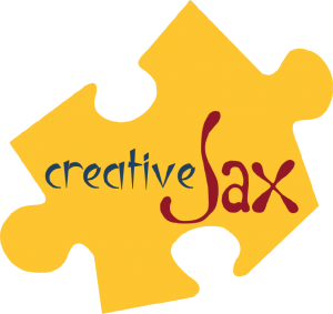 I’m going to start by sharing how I came up with my logo.
The name? “creativeJax”
The “Jax” is easy – my nickname. Names are funny things – I was christened “Jacqueline”. So my birth certificate has Jacqueline on it – but that name was never used to refer to me! (FYI – I don’t answer to Jacqueline). From birth I was “Jackie” – not “Jacque” as may have been expected. I was Jackie throughout school, study and several careers! Most of my family still call me Jackie.
I’ve only really had two nicknames – “Ginge” and “Jax”. The “Ginge” was an endearment within my extended family as a child – bet you can guess why! It has fallen by the wayside over the years – probably a good thing as with the passing of the years, it is not a valid nickname any longer! I’ve been called “Jax” by a range of friends and family over the years and it’s a name that I feel comfy in.
I guess the Jackie is the more formal me and the Jax is the is the relaxed me. I happily answer to both these names and in fact I use them both myself.
As far as “creative” goes – it’s partly about me creating “things” but also about my love of all sorts of created “things”. And by “things” I don’t just mean tangible items like crafts, sewing, baking or art etc, or architecture, but also the intangibles – ideas, opinions, beauty, memories, etc and the amazingly awesome world we live in. I’ve always loved to make things and to think outside the box, I enjoy creating special times and memories and I want to do my bit to create a better world!
So “creativeJax” is a good fit for who I am.
Also, I am part of Kristine McNickle’s “Team Creative” – check out Kristine’s Creative Stamping Website. So the creative part was relevant within the Stampin’ Up! context.
The puzzle piece?
Well I’ve chosen the puzzle piece to be part of my logo for a couple of reasons. I guess I think we are all pieces in the wonderful but complex puzzle that makes up “life, the universe and everything” and that each of our individual lives is a puzzle made up of many pieces. You can check out my About page to read about some of the puzzle pieces that make up my life.
Puzzle pieces are also used in the logo of Autism New Zealand which is relevant to our family as our daughter has Asperger’s Syndrome. Check out their website here.
The colours?
This was a really hard decision – there are so many cool colours that I love. I love neutrals, I love bright colours, I love rich colors. In fact probably the only colours I don’t rave about are pastels.
I love how you can mix colours to get new ones and this lead me to think of primary colours. Primary colours are sets of colours that can be combined to make a range of colours. Red, yellow and blue are a set of primary colors. Of note, as human eyes are trichromatic (we have 3 types of receptor cells in our eyes that respond to light) our sets of primary colours are usually made up of 3 (tri) colours. You can check out a wiki article about primary colours if you”d like more info. (This little aside of info is one of the things I tend to do in real life – go off on a tangent! There are so many interesting, and sometimes useful, pieces of information that I feel compelled to share!)
While the red, yellow blue set of primary colours has largely been replaced with other sets, I still love them as they remind me of childhood – who hasn’t made a colour wheel using these three colours? In fact the three colours I have used are taken from the new “Stampin’ Up! Regal Colors Collection”. They are: “Cherry Cobbler“, “Crushed Curry” and “Night of Navy“.
And the fonts?
Again so many choices!
I really wanted to create my own font for my name so it would be unique to me! But font design was something that I knew nothing about. Not to be deterred I did what I always do when faced with an unknown – lots of research on “how-to”. Armed with new found knowledge, a vision of what I wanted and my “I-will-be able-do-it” approach – I succeeded – go me! So “Jax” uses the font I created – a somewhat quirky, irregular font that is fun.
The “creative” uses the font “luteous viscous”. This font appealed with its sharp angles and diagonal lines. I love the quirky irregularity and softness of my own font and I chose luteous viscous as a contrast with its rigid angularity. The contrast in these two fonts reflect the juxtaposition I repeated have in my own creative endeavours. From doodling to sculpturing to sewing I seem drawn to either sweeping soft curves or sharp triangles and cubes.
So when I put it all together – my logo was born!
Whew that was quite an essay.
Until next time,
Jackie


2 comments
Hi Sheryl,
Thanks for your kind and encouraging comments.
So pleased you got the parcel – enjoy!
I have found Pinterest and I do agree, it is a great place to get inspiration.
I hope we manage to meet up one day.
Jackie
Hi Jackie
Well done on your new venture with Stampin Up and your blog! I would like to set up my own blog one day!
Thank you for you lovely card and thoughts with my Brilliant Blue DSP package I recently purchased.
I find lots of inspiration on Pinterest – bet you would enjoy Pinterest if you’re not exploring it already?
All the best with your crafty creations and your family etc.
Who knows – I might meet you one day in the crafty circles!
Kind Regards,
Sheryl Wanhill (Auckland)