Brilliant colours – brilliant technique – brilliant team!
Welcome to Colour INKspiration Challenge number 19. And we are lucky to have Cathy Pinchbeck join us as a guest designer.
The Colour INKspiration Crew is kicking the Challenge off with a Blog Hop. You may have hopped on over from the brilliant Monique Fisher – or you may be starting the hop here – either way – a big welcome! You are currently at Jackie Noble aka CreativeJax
A reminder that if you are not part of the Colour INKspiration Facebook Group please do join the group. It’s a place where crafters from throughout the world can share their creativity all inspired by a Pinterest Inspired Colour Swatch.
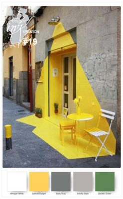
This week we have a brilliant colour palette to work with courtesy of Liz!
The Challenge colours are: Whisper White, Daffodil Delight, Basic Gray, Smoky Slate, Garden Green.
My brilliant Upline – Kristine McNickle – shared the brilliant Faux Patina Technique at a recent team meeting. SHe had been reminded of it after receiving a gorgeous swap from our brilliant Team Leader – Jacque Williams.
(Generally speaking – a patina is a coating of chemical compounds such as oxides or carbonates. This forms on the surface of metals, or other compounds, when they are exposed to the weather. They can take a long time to form. A patina can really add to the value of a piece of artwork. A faux patina is a false patina and can be added to all sorts of objects – bowls, statues, woodwork, buildings – even cards!)
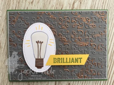
I decided the faux patina would be brilliant to use on congratulation cards for some of the brilliant members of my thINK Creative Team recently! Each month I recognise and celebrate various milestones and achievements of Team Members at my Team Meeting. So this was a brilliant card for them!
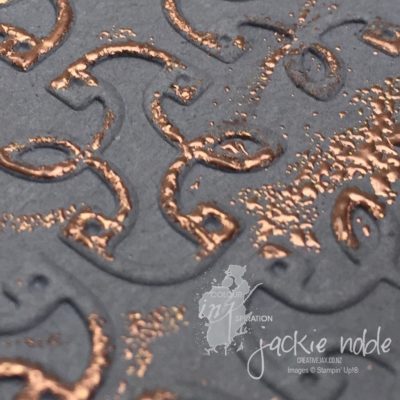
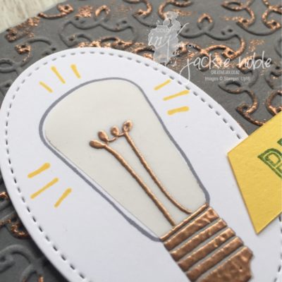
You can’t really tell how brilliant this technique is from the shot above – but here’s a closeup – a brilliantly close closeup!
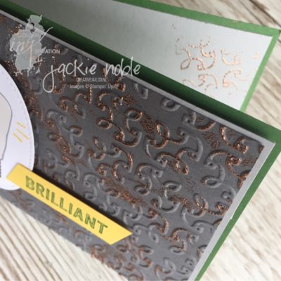
The Big Shot was used to texture emboss my piece of Basic Grey cardstock with the Trellis Garden embossing folder. I then gently rubbed my Versamark inkpad over the raised surface. Some went between the raised portions but that was okay – just adds more interest.
I then sprinkled Copper Stampin’ Embossing Powder and it stuck where the Versamark was. I could then do another brilliant technique – heat it with the Heat tool and watch the powder melt! Copper and the other metallic powders give such a brilliant result when heat embossed!
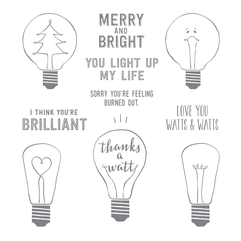
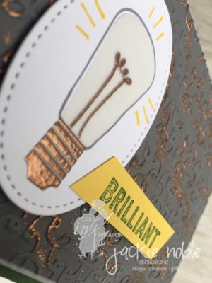
On a piece of Whisper White which I had cut out using an oval from the Stitched Shapes Framelits Dies, I stamped one of the lightbulbs from the Watts of Occasions stamp set. There is such a great range of cute images and sentiments in this set.
I stamped the lightbulb in Basic Grey some of the “brightness lines” (not sure what else to call them!) in Daffodil Delight. They make the lightbulb appear to shine brilliantly!
On vellum, I restamped the lightbulb in Versamark and then heat embossed it in Copper! Mmmm delicious!
I cut out this lightbulb – trimming inside the copper line around the outside of the bulb so that when I layered it onto the card you would see the Basic Grey as the Lightbulb edge. I thought the vellum and the copper filament and bulb base made it look more like a lightbulb! Another advantage of the copper on the vellum is that I could easily adhere it with Multipurpose glue and not be worried about it showing through the vellum – brilliant!
The Basic Grey cardstock was matted with Smoky Slate and then popped this onto a Garden Green card base with dimensionals.
Inside the card, I adhered a liner of Whisper White onto which I had put a small section of copper embossing. This was done by putting some Versamark onto the Garden Trellis Embossing folder, stamping that onto my card and then heat embossing.
So my embossing folder got a brilliant workout with this card!
The stitched oval was also attached with dimensionals.
The Brilliant sentiment was stamped onto a strip of Daffodil Delight cardstock and attached with dimensionals too!
Of course, the Brilliant sentiment has some other words. But I just wanted “Brilliant”. So I used my Garden Green Stampin’ Write marker to apply ink to just that word. I use my markers like this very frequently! Another brilliant idea!
Keep on hopping along to see many more gorgeous projects from the Crew using these great colours. Next up is the talented Tanya Bell. Check out her fabulous card!
Thanks for taking part in our blog hop, there are so many amazing ideas and inspiration you don’t want to miss. Remember that currently, you are at my blog Jackie Noble | creativeJax
REMEMBER
- The Designer Series Paper (DSP) sale runs until the end of October. Buy 3 and get 4 on selected DSPs – check which ones are included by clicking on the image below.
- If you live in New Zealand and would like a copy of the new catalogue, please contact me.
- If you live in New Zealand and would like a demonstrator to order through – I’d love to have you join my group of crafty customers. Let’s journey together! – Shop Now or contact me.
- If you live in New Zealand and would like to know more about becoming a demonstrator – Check out the info HERE. I’d love to have you join my thINK Creative Team!
Until next time
As always – if you wish to know anything more about info in this post, or to get a catalogue, or to join my thINK Creative Team, or to buy any of the items mentioned in the post – please contact me.
Or you can shop 24/7 at my online Stampin’ Up! shop
Please do use the hostess code to support creativeJax if you are ordering online!
Entering the Hostess code combines the value of online orders – which assists me to offer events and thank you’s for my customers and support charities such as Ronald MacDonald House and local events where I donate product and/or classes.
The current Hostess Code can be found at the top right of my webpage.
If your order is over $300, please do not use this code as You become the hostess and get the Rewards!
If you would like to find out about joining my Stampin’ Up! Team (thINK Creative) – Please do get in touch – I would love to chat to you about that.
You can receive my Blog Posts directly by email or join my monthly Newsletter group – you can subscribe using the buttons at the right of my page.




13 comments
Skip to comment form
Author
Awh Kelly – You are too kind! Thank you! It’s funny – I never think I have a style!
I adore your style Jackie. Another great card – love the copper embossing! Kelly x
love the patina affect on your project
I absolutely love the touches of embossed copper, Jackie. Such a lovely addition to the Challenge colours. D xox
Oooooh I’d forgotten about that technique Jackie. You have used it to perfection. Gorgeous card.
Jackie your lightbulb is just perfect! So clever …
What a brilliant technique card and so many brilliant skills and ideas. And the write up was totally brilliant too. I love it all.
Sooo many amazing -brilliant- techniques. Thanks so much for the explanations. Love it all
That is such a cool effect Jackie. Love the copper and grey together. xx
Author
Thanks Julie! Brilliant of you to say!
Author
Thanks Rachel – I agree – I just love the look of copper embossing!
I must add … this is brilliant!
Oooh Jackie, this is a lovely. The embossing folder with copper heat embossing is pure luxury.