Brisbane Convention

I can’t believe that the South Pacific Stampin’ Up! Convention in Brisbane was almost two months ago. I have been rather swamped since returning and have neglected this page! I’ll be working hard to make sure that doesn’t happen again and decided to share a little about my time in Brisbane. Convention was such an amazing few days – wonderful people and so inspiring!

2013_05_22 Jax at Convention

Here’s me at the “Be the Difference” Stampin’ Up! Convention in Brisbane

We learnt really useful things in the business presentations and saw some amazing techniques demonstrated. Got to meet Stampin’ Up! employees from Australia and from the Home Office in Utah, USA. I had the pleasure of meeting co-founder Shelli Gardiner as well as hearing her speak and watching her craft – very cool! We got to use several new products from the 2013-2014 catalogue – very exciting! The Make-n-Takes shown below were lots of fun to participate in.

2013_05_22 Make n Takes

Convention Make n Takes

Swaps are one of the great things at Convention, so as this was my first Stampin’ Up!  convention I decided to participate. I was really keen to to an MDS project as a swap and decided to combine two techniques that are very popular at the moment – Subway Art and Blackboard Technique.

2013_05_22 Convention swaps green 500x375

Brisbane 2013 Stampin’ Up! Convention Swap. Made in MDS using Chalkboard and Subway Art techniques

Subway Art uses text (mostly) to fill up the entire area of interest. Click HERE to see some examples of Stampin’ Up! subway art projects on Pinterest. Rather than using lots of different colours I did my subway art using the “Chalkboard” technique. Just like the name suggests, this technique looks as if it is done on a chalkboard. Click HERE to see some examples of Stampin’ Up! chalkboard projects on Pinterest. Using lots of text boxes I inserted all sorts of words relating to Convention 2013 onto my project page in MDS. These were the names of classes and events, locations, descriptions, activities etc.  One of the things I love about MDS is that all the fonts installed on your computer are available to use from within the program itself – so cool! MDS is a very easy and intuitive program to use. Check out my MDS page for further information.

2013_05_22 Convention swap pinl 500x375

Brisbane 2013 Stampin’ Up! Convention Swap. Made in MDS using Chalkboard and Subway Art techniques

Once I had my card front just as I wanted, I saved and exported the project as a jpeg – one of the file formats that you can export from MDS as. I then got the picture printed at my local photo printing outlet. If I was just doing few projects, then I would have printed them at home – but as I was printing 125 with mostly black ink, I decided to use a professional printing service. At 15c/print these were very economical. It was then a matter of constructing the cards themselves. I chose colours that provided contrast to the black and white of my image and that were carrying through to the new catalogue. For the mat I selected 2 colours, Blushing Bride or Pink Pirouette, and the card bases were either Wild Wasabi or Mambo Melon. It was such fun (and quite a frenzy) swapping with other demonstrators. Thanks to all those who participated – I have an amazing collection of swaps including cards, 3D projects, fabric items, key chains, labels. Some of which are in the photo below.

2013_05_22 Swaps

A selection of the fantastic swaps from the Stampin’ Up! Convention 2013 in Brisbane

People are so creative! The photo below shows the magnificent convention gifts from Brisbane.  I was awestruck by the large number of “All Attendee Prize Patrols” in this the 25 year anniversary of Stampin’ Up!. Now that the new catalogue has been released I can share this photo – though there are still a couple of blurred areas for products in upcoming catalogues. These items are of great assistance to me as a demonstrator. 2013_05_22 Convention giveaways with Watermark


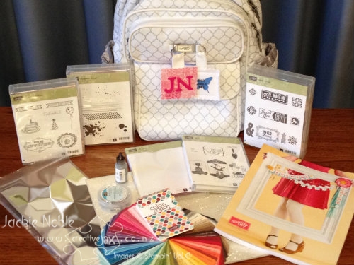
I am sure Convention 2014 in Melbourne will be every bit as much fun and just as inspiring! Maybe you will be there too! Logo 72pt


Until next time Jackie


My Convention Swap Project Supply List:

Card/Paper: Mambo Melon (119980)  Blushing Bride (131287)  Wild Wasabi (11850)   Pink Pirouette (116203) 

Techniques: Chalkboard and Subway Art     

MDS ( MDS Supplies – Background: Card Stock/Basic Black  Stamps: Designer Kits/Hello World; Letter It; Vintage Overlays DSP: Hello World 


Permanent link to this article: https://creativejax.co.nz/2013/07/brisbane-convention/

Baby Card – Marbling Technique

Hello

Below is a card I recently made for friends who had baby. Awesome wee man to go with his awesome first-time Mum and Dad.

2013_05_21_Baby card_1

Primary colours again – though this time Real Red,  Pacific Point and Daffodil Delight.

I revisited my “kindy-help” days when I made this – finding some marbles in our son’s drawers and using the ink from the re-inkers of the same colour as the cardstock; I marbled the pattern on Whisper White Cardstock. The technique and colours were just made for babies!

2013_05_21_Baby card_5 2013_05_21_Baby card_2 2013_05_21_Baby card_4

The large jumpsuit was one of the images on the Baby Tees Jumbo wheel. The shining star was created by using Crystal Effects – perfect for the effect I was after.

For this card I did use a retired punch (Pinking heart corner Punch) but the scallop trim corner punch (118870) would be just as effective.

Logo 72pt

Until next time

Jackie

Project Supply List:

Ink: Real Red (pad 126949, refill 103287), Pacific Point (pad 126951, refill 111840), Daffodil Delight (pad 126944, refill 119672)        Stamps: Baby Bundle Stamp Set (Wood 121482, Clear Mount 120576), Baby Tees Jumbo Wheel (118621)        Card/Paper: Whisper White (106549)       Accessories: Brights 3/16″ brad (119740), Crystal Effects (101055)     Tools: Paper-Piercing Tool (126189), Word WIndow Punch (119857)


Permanent link to this article: https://creativejax.co.nz/2013/05/1st-post-by-email/

Hello world!

Hiya – that’s hello from me!

Welcome to my blog and website. Thanks so much for stopping by.

Wow a first post is a scary but exciting thing. Where to begin?

Logo 72pt  I’m going to start by sharing how I came up with my logo.

The name? “creativeJax”

The “Jax” is easy – my nickname.  Names are funny things – I was christened “Jacqueline”.  So my birth certificate has Jacqueline on it – but that name was never used to refer to me!  (FYI – I don’t answer to Jacqueline).   From birth I was “Jackie” – not “Jacque” as may have been expected. I was Jackie throughout school, study and several careers!  Most of my family still call me Jackie.

I’ve only really had two nicknames –  “Ginge” and “Jax”.  The “Ginge” was an endearment within my extended family as a child – bet you can guess why! It has fallen by the wayside over the years – probably a good thing as with the passing of the years, it is not a valid nickname any longer!  I’ve been called “Jax” by a range of friends and family over the years and it’s a name that I feel comfy in.

I guess the Jackie is the more formal me and the Jax is the is the relaxed me.  I happily answer to both these names and in fact I use them both myself.

As far as “creative” goes – it’s partly about me creating “things” but also about my love of  all sorts of created “things”.  And by “things” I don’t just mean tangible items like crafts, sewing, baking or  art  etc, or architecture, but also the intangibles – ideas, opinions, beauty, memories, etc and the amazingly awesome world we live in.  I’ve always loved to make things and to think outside the box, I enjoy creating special times and memories and I want to do my bit to create a better world!

So “creativeJax” is a good fit for who I am.

Also, I am part of Kristine McNickle’s “Team Creative” –  check out Kristine’s Creative Stamping Website. So the creative part was relevant within the Stampin’ Up! context.

The puzzle piece?

Well I’ve chosen the puzzle piece to be part of my logo for a couple of reasons. I guess I think we are all pieces in the wonderful but complex puzzle that makes up “life, the universe and everything” and that each of our individual lives is a puzzle made up of many pieces. You can check out my About page to read about some of the puzzle pieces that make up my life.

Puzzle pieces are also used in the logo of Autism New Zealand which is relevant to our family as our daughter has Asperger’s Syndrome. Check out their website here.

The colours?

This was a really hard decision – there are so many cool colours  that I love. I love neutrals, I love bright colours, I love rich colors. In fact probably the only colours I don’t rave about are pastels.

I love how you can mix colours to get new ones and this lead me to think of primary colours.  Primary colours are sets of colours that can be combined to make a range of colours. Red, yellow and blue are a set of primary colors.   Of note, as human eyes are trichromatic (we have 3 types of receptor cells in our eyes that respond to light) our sets of primary colours are usually made up of 3 (tri) colours.  You can check out a wiki article about primary colours if you”d like more info. (This little aside of info is one of the things I tend to do in real life – go off on a tangent!  There are so many interesting, and sometimes useful, pieces of information that I feel compelled to share!)

While the red, yellow blue set of primary colours has largely been replaced with other sets, I still love them as they remind me of childhood – who hasn’t made a colour wheel using these three colours? In fact the three colours I have used are taken from the new “Stampin’ Up! Regal Colors Collection”. They are:Cherry Cobbler, “Crushed Curry” and “Night of Navy“.

And the fonts?

Again so many choices!

I really wanted to create my own font for my name so it would be unique to me! But font design was something that I knew nothing about. Not to be deterred I did what I always do when faced with an unknown – lots of research on “how-to”. Armed with new found knowledge, a vision of what I wanted and my “I-will-be able-do-it” approach – I succeeded – go me! So “Jax” uses the font I created – a somewhat quirky, irregular font that is fun.

The “creative” uses the font “luteous viscous”.  This font appealed with its sharp angles and diagonal lines. I love the quirky irregularity and softness of my own font and I chose luteous viscous as a contrast with its rigid angularity. The contrast in these two fonts reflect the juxtaposition I repeated have in my own creative endeavours. From doodling to sculpturing to sewing I seem drawn to either sweeping soft curves or sharp triangles and cubes.

So when I put it all together – my logo was born!

Whew that was quite an essay.

Until next time,

Jackie

                    Logo 72pt


Permanent link to this article: https://creativejax.co.nz/2013/05/hello-world/